Post Office
June 2023 - June 2024 (FTC)
Post Office’s Savings website (2024)
I worked in collaboration with Bank of Ireland to redesign Post Office’s Savings website in adherence with their design system.
I began by auditing the existing site, mapping the customer journey and using web analytics to identify key exit points. In collaboration with the Product Owner, I engaged early and often with the commercial team, including their partners at Bank of Ireland in order to elicit core business requirements.
Who we redesigned it for
The user research team had carried out an extensive customer segmentation project, which served to categorise the various types of Post Office user across the UK. Their savers mostly fell into three categories:
Fledglings - Techy & ethical, just starting out and want guidance
Fretters - Strapped for time and cash, don’t feel in control
Sages - Older and financially stable, confident, like customer service
Balancing compliance and user experience
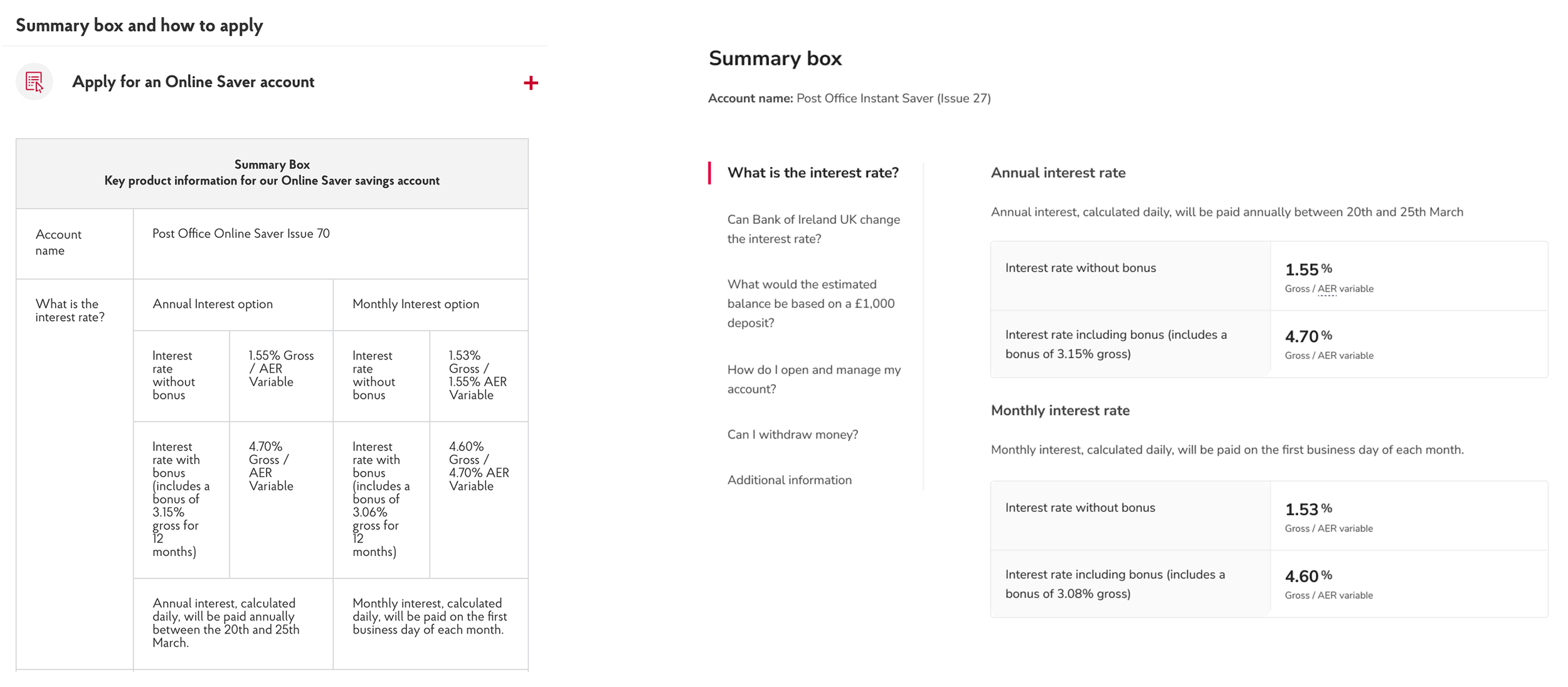
Using Axure and Figma, I produced prototypes for the purposes of usability testing and in order to demonstrate the interaction design of critical components to stakeholders. For example, the ‘summary box,’ a regulatory requirement which outlines the key information of a savings account, was previously concealed in a series of accordions,, which were inaccessible and a barrier to conversion.
By prototyping a pattern using vertical tabs, I was able to convince the compliance team that this would satisfy regulations whilst improving user experience and business outcomes, in much the same way as I did at Virgin Money.
From accordions to vertical tabs, a new design pattern for the savings summary box
Optimisation initiative
I also took a leading role in establishing a CRO initiative across Post Office's design, research and analytics teams, as well as external partners including Eclipse Group.
We began by identifying core sales journeys and composing design hypotheses, before carrying out testing on the website using Quantum Metric. We then used this feedback to inform our design decisions.
For example, we hypothesised that the Savings homepage was a barrier to conversion on mobile, where we observed a significant drop in users accessing individual product pages. As such, we conducted an A/B/C test, which compared the efficacy of three design solutions. We found that option B led to more users accessing individual product pages.
We conducted an A/B/C test on the Savings homepage, which compared the efficacy of three design solutions.
Outcomes after six months
Transactions, Net Promoter Score (NPS) and Customer Satisfaction Score (CSAT) all increased within the first six months of redesigning and optimising the savings website.


